Our
Client
Calgary TELUS Convention Centre (CTCC)
Industries
Event Venues
Hospitality
Convention & Trade Show
Services
UX Strategy
Website Design
Web Development
Content Strategy
SEO
HubSpot CRM Integration
How do you redesign a convention centre website without it looking like just another convention centre?
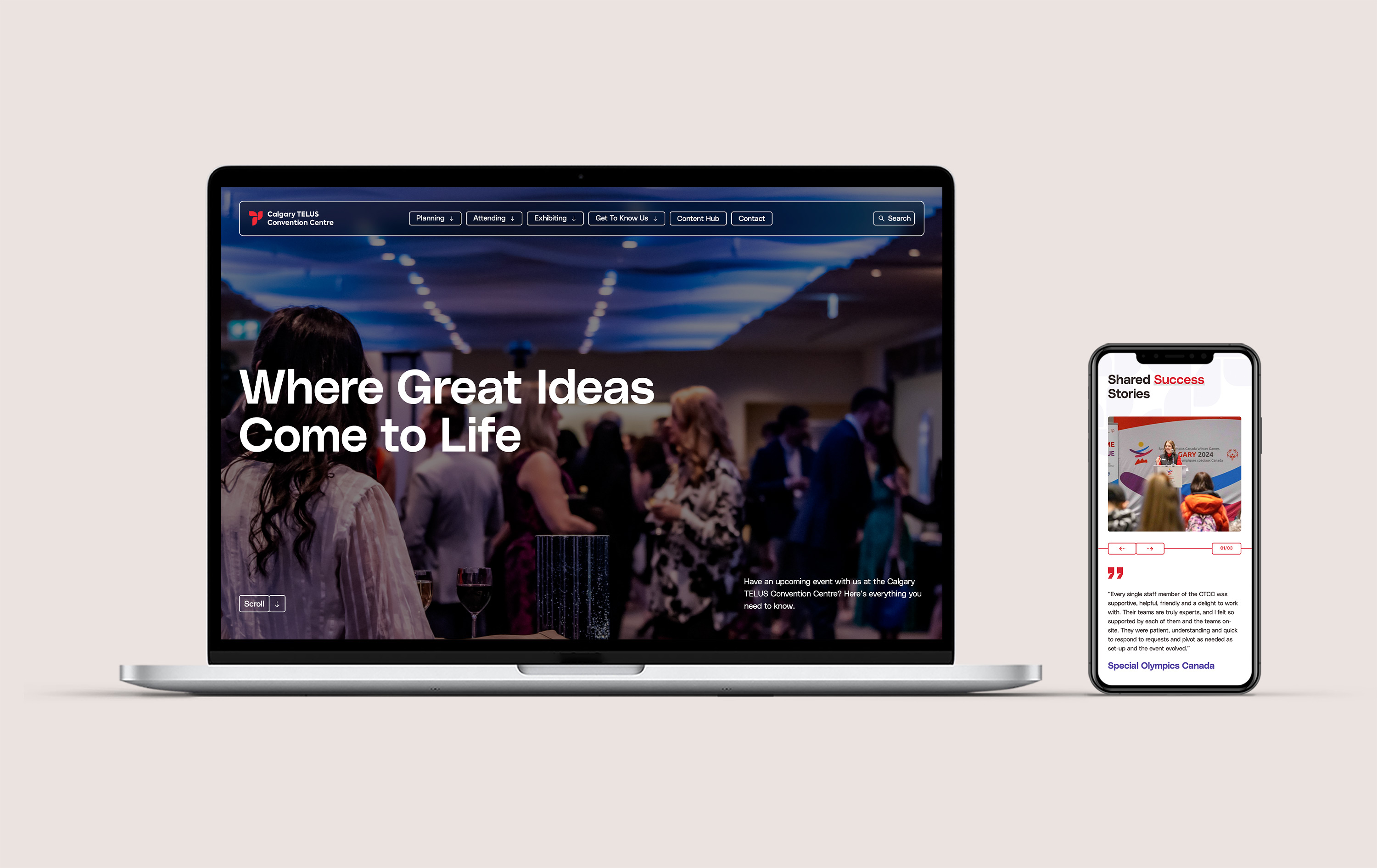
That was the real question in front of us. The Calgary TELUS Convention Centre isn’t selling one thing. It’s selling a hundred different rooms to a hundred different kinds of event planners, and every one of them is deciding in about eight seconds whether this place can hold their event. The old site wasn’t doing that work. So we didn’t patch it. We redesigned and rebuilt it.
The problem
A venue of this scale and reputation had a website that couldn’t keep up with what it was selling. Planners landing on the site couldn’t quickly visualize their event in the space, find the room that fit their needs, or take the next step without running into friction. The visual identity felt dated. The booking forms were a barrier rather than an invitation. And the photography, while decent, wasn’t doing the emotional work that converts a planner who’s browsing into a planner who’s ready to commit.
For a venue category where trust is built visually and fast, that gap was costly. Event planners don’t come back for a second look. If the site doesn’t give them a reason to picture their event in that room within the first few seconds of seeing it, the next venue on their list gets the inquiry instead.
The numbers confirmed what the experience already felt like. Traffic was flat, form submissions were low, and the site was working against a sales team that was doing everything right on the phone and in person. The disconnect between the real venue and the digital one was where revenue was being lost.
The solution
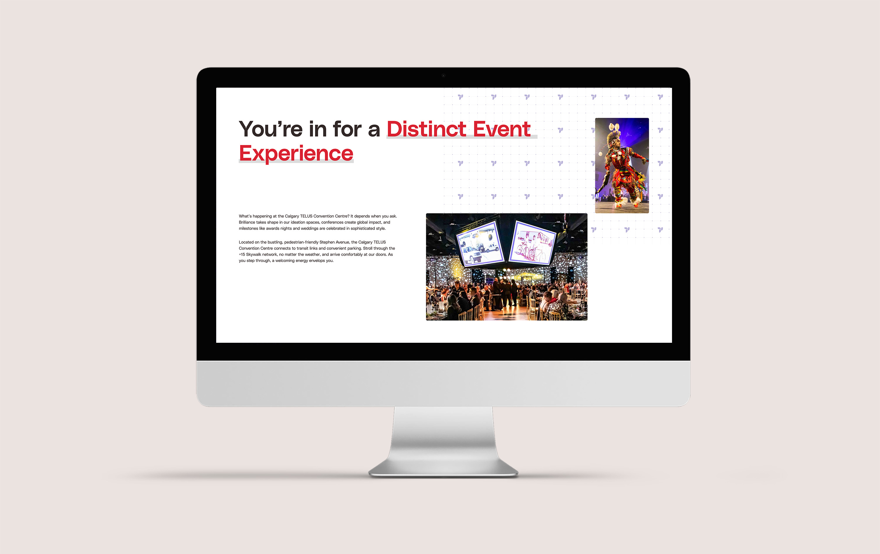
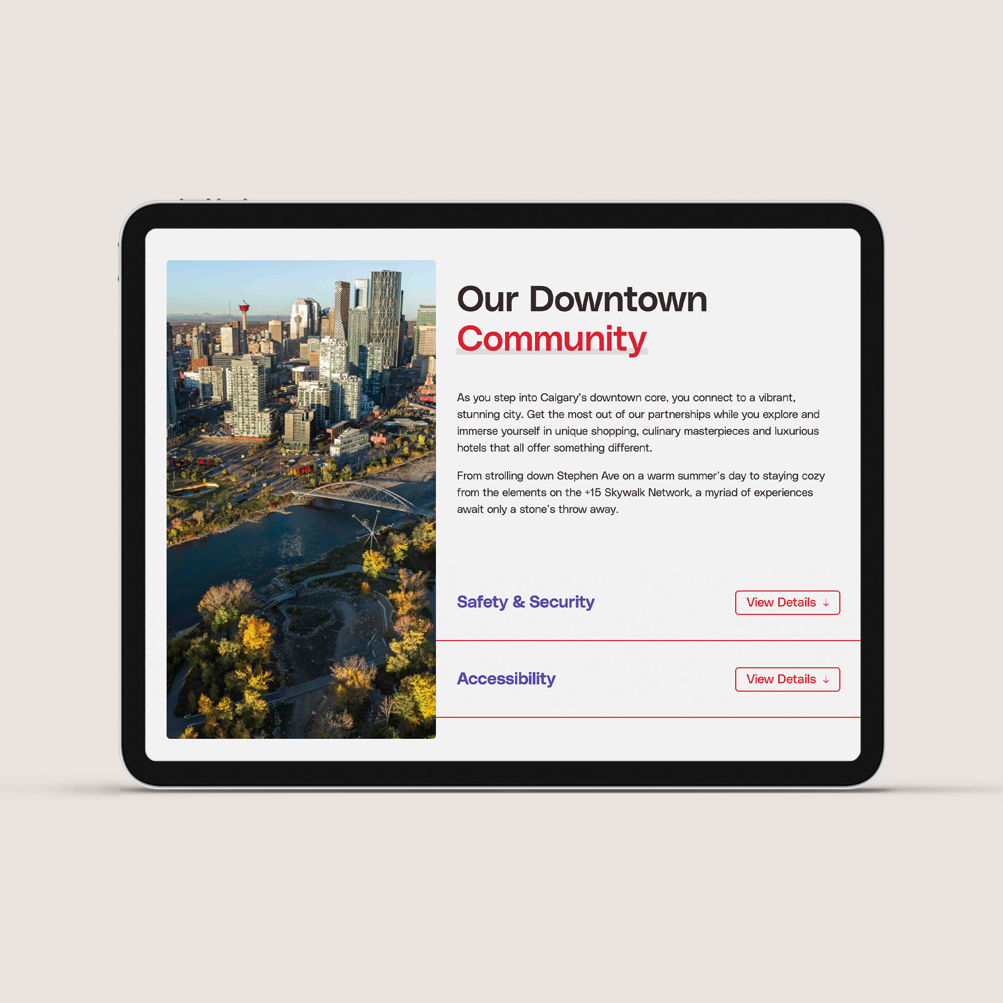
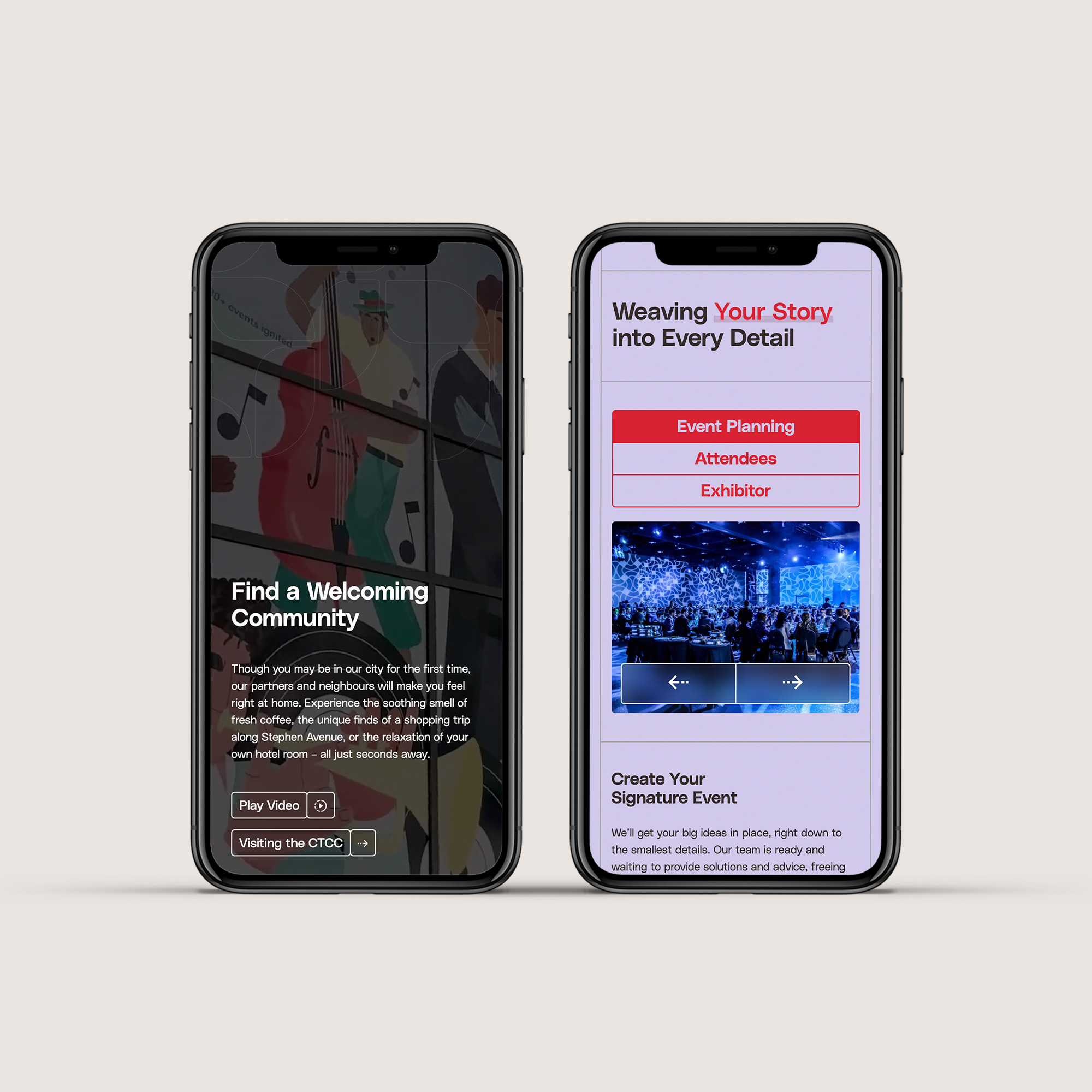
Studiothink designed and rebuilt CTCC from the ground up. New visual identity. Event space galleries designed not just to show a room but to help a planner picture their event happening inside it. Booking forms that removed friction at every step and connected directly to the team through HubSpot CRM integration. And a navigation structure rebuilt around how different visitors actually move through a site, whether they’re planning a trade show, booking a wedding, or attending a conference and trying to find parking.
We didn’t launch and walk away either. Deadlines shifted, feedback came in, we adjusted. That’s the part clients notice more than the pixels, and it’s the part that determines whether a project ends with a handoff or a partnership.
The results speak for themselves. Site traffic up 8%. Form submissions up 12%. And the line from their review that we’ll take over almost any metric: “It was very clear that this was a partnership.” Not a vendor. A partner. That’s the work we live for.