Our
Client
Students Union of Vancouver Community College
Industries
Education
Non Profit
Student Organizations
Link
Services
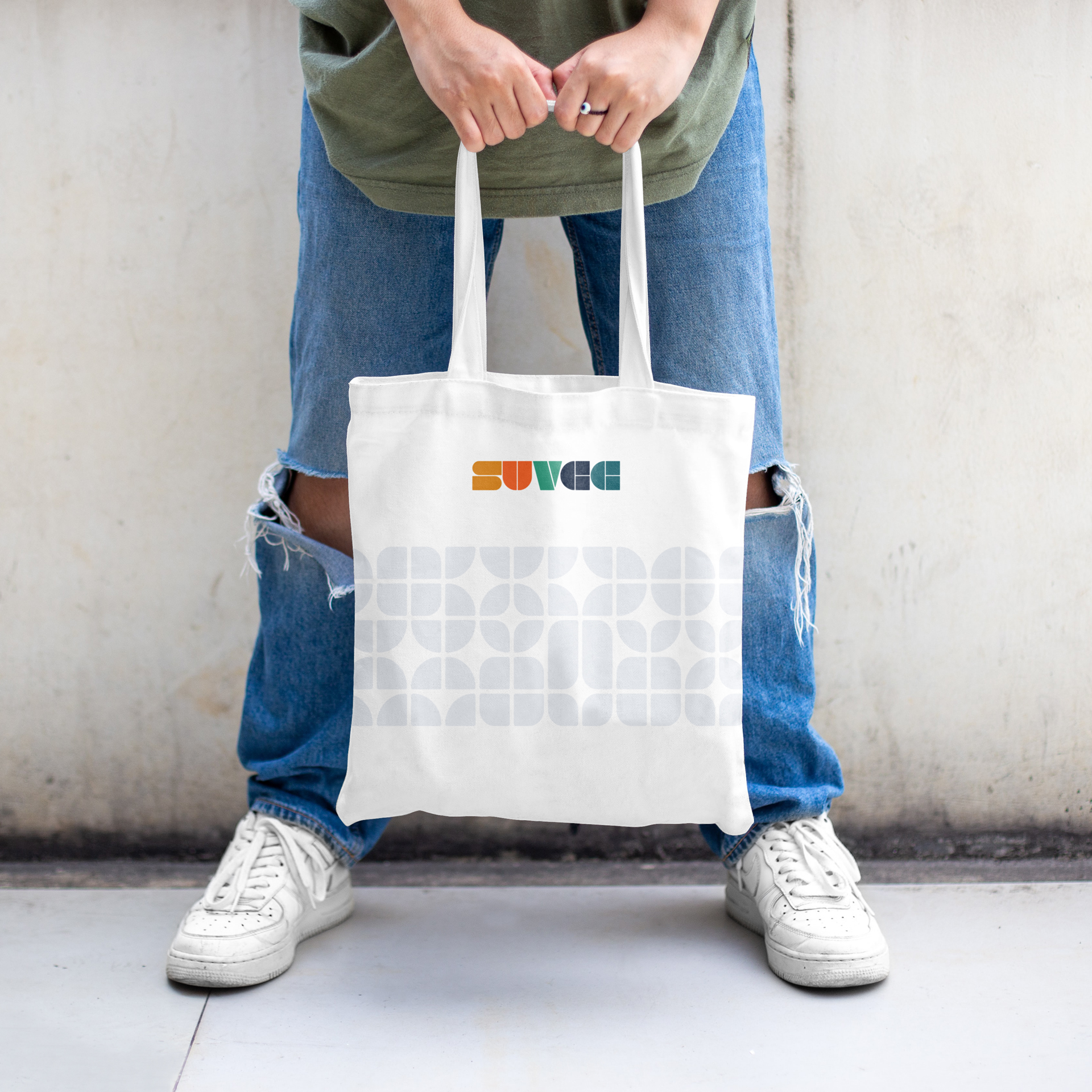
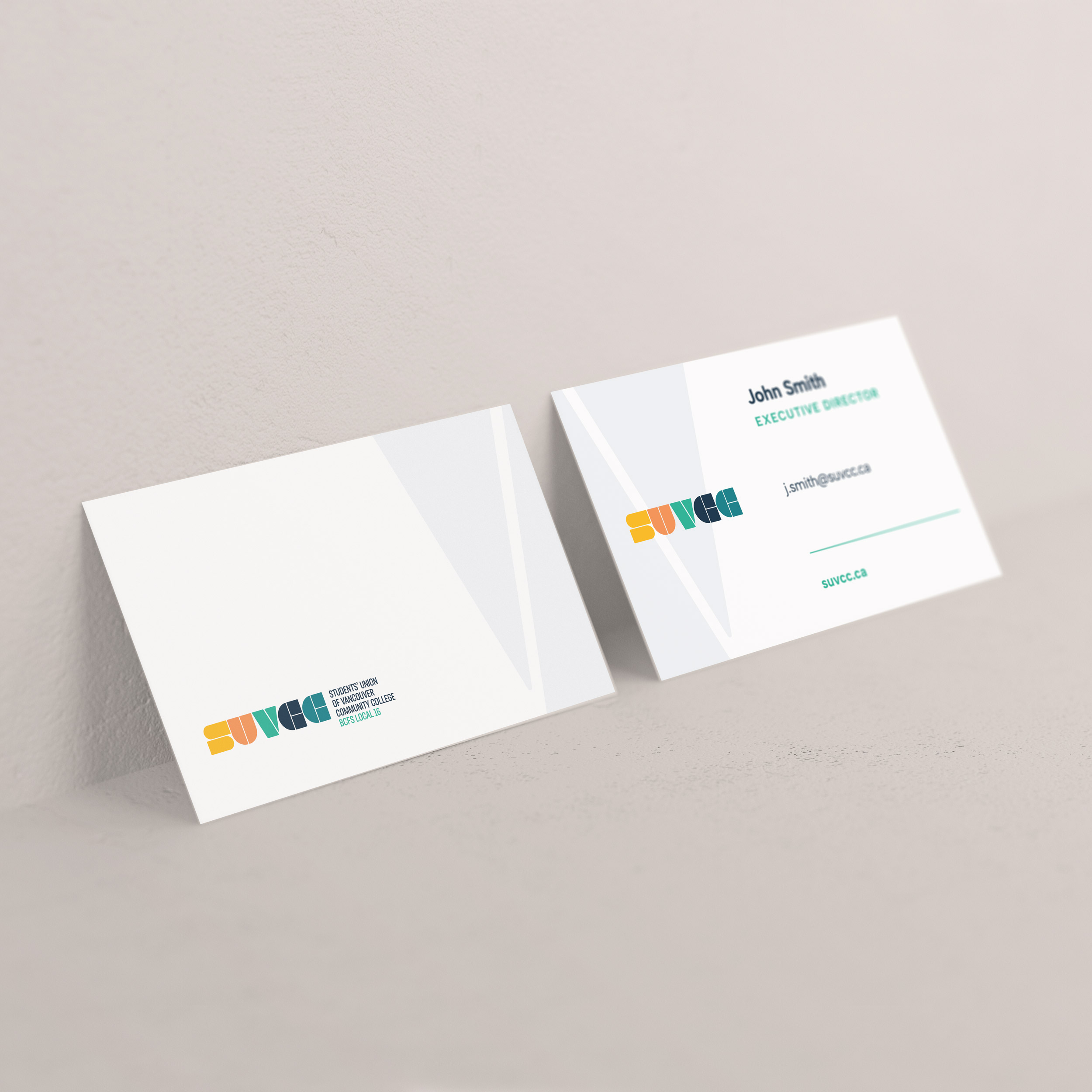
Brand Identity
Logo Design
Website Strategy
UX and UI Design
Web Development
SEO
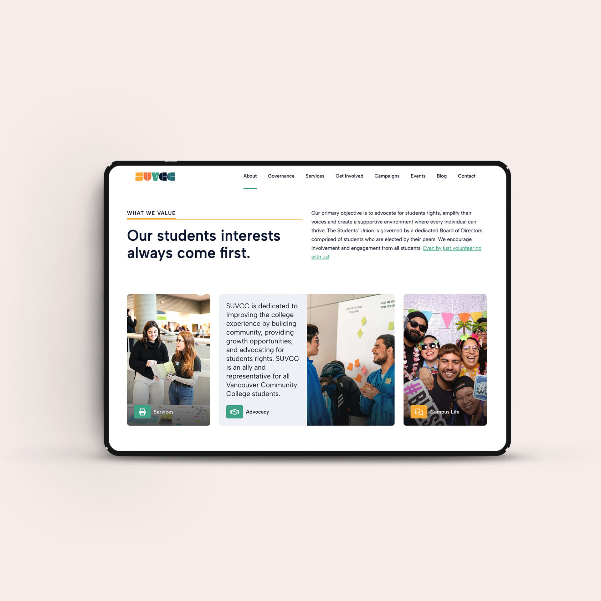
Giving a powerful student voice a brand and platform to match.
There is nothing average about the Students Union of Vancouver Community College.
Since 1974, SUVCC has existed to advocate for students, support them through real world challenges, and ensure they are seen, heard, and represented. From fighting for fair access to transit to providing essential services that make student life easier, SUVCC has a long history of showing up when it matters most.
As the needs of students evolved, SUVCC recognized the need to evolve their brand and digital presence as well. They needed a clear, confident identity and a user friendly website that could raise advocacy awareness, make services easier to find, and better connect with a diverse and often commuter based student population.
Studiothink partnered with SUVCC to modernize their brand and build a digital experience that reflects the organization’s purpose, values, and impact.
The problem
SUVCC’s existing brand and website were not fully supporting their role as a primary advocate and resource for students.
Key services were not always easy to find, advocacy work lacked visibility, and the overall digital experience did not reflect the warmth, trust, and support students experience in person. For an organization built on connection and action, the brand needed to feel more human, accessible, and aligned with how students actually engage online.

The solution
We couldn’t start our work without playing a round (we picked the Ridge) and grabbing a meal at Duffy’s. To create something truly inspiring, you have to really feel it and to experience all Northview has to offer, you have to be there. With this foundation, our team got to work crafting a powerful brand and website strategy founded on connection and creating human experiences.
With a repositioned brand direction and a strategic UX to guide them, our designers brought accessible luxury to life. Influenced by colour psychology, deep greens were woven throughout the site along with big, beautiful images to craft the ultimate experience. And to really appeal to the different audiences–namely brides—a mini-site was created within the master site to better cater to couples planning their upcoming weddings and to increase event space bookings.
You can’t reposition a brand without expert copywriting. Yah, you might think pictures are worth a thousand words, but to really take a user on a journey, there has to be story. Warm and modern, Northview’s brand voice appeals to audiences old and new, golfers and brides, event planners and restaurant goers.
Our developers were tasked with the job of bringing this together, custom coding a beautiful site full of minute details and artful touches that truly embodied the new Northview. You could say the result was a hole-in-one.