Our
Client
Vanderveen Hay & Pet Supply
Industries
Agriculture
Livestock Feed & Pet Supply
Retail
Link
Services
Brand Strategy
Brand Voice
Copywriting
Logo Design
Website Strategy
UX and UI Design
Web Development
SEO
A family business with the legacy to back it up and a brand and website finally built to prove it.
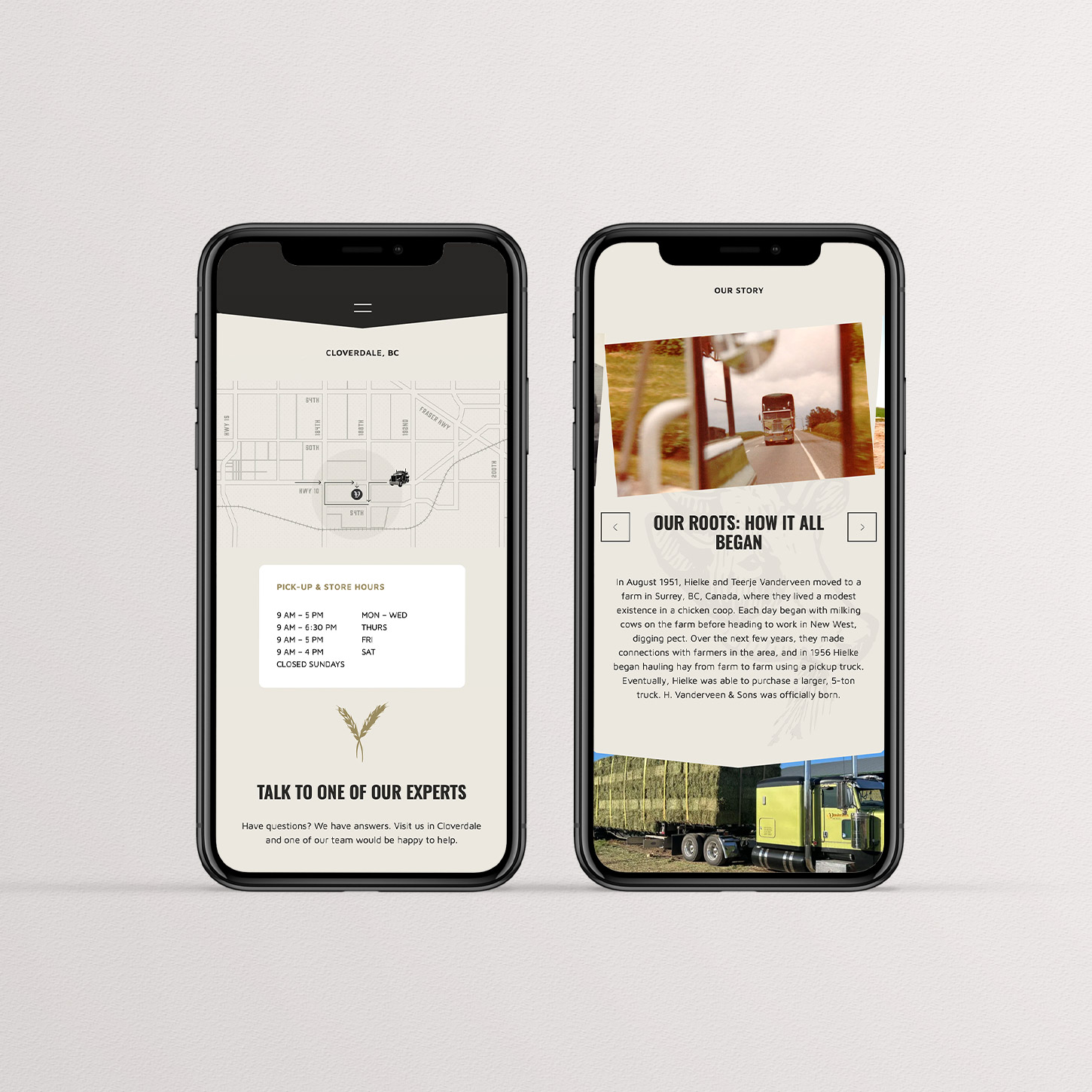
Vanderveen is a family business with deep roots across BC’s Lower Mainland, Vancouver Island, and the Sunshine Coast. For decades, their name in hay sales was built entirely on trust, reputation, and the kind of old-fashioned integrity that gets passed down alongside the keys to the farm.
When they expanded into pet food and supplies, they had the products, the space, and the conviction to do it right. What they didn’t have was a brand that reflected any of it.
Studiothink was brought in to change that.
The problem
The name Vanderveen Hay Sales said exactly one thing, and it wasn’t pet food or farm supplies. For anyone outside the farming community, the business effectively didn’t exist. The retail store was difficult to find with no road signage, no clear entrance, and no online presence to guide a new customer through the door. A business built on generations of trust had become invisible to the very people it was trying to reach.
The gap between what Vanderveen offered and what the market understood them to be was real and growing. Loyal hay customers knew where to find them. New pet owners, hobby farmers, and livestock managers looking for quality feed and supplies had no way to discover them at all. Their strongest asset, a reputation earned over generations, wasn’t working hard enough for the next chapter of the business.
The brand was anchored to a single product in a company that had long since grown beyond it.
The solution
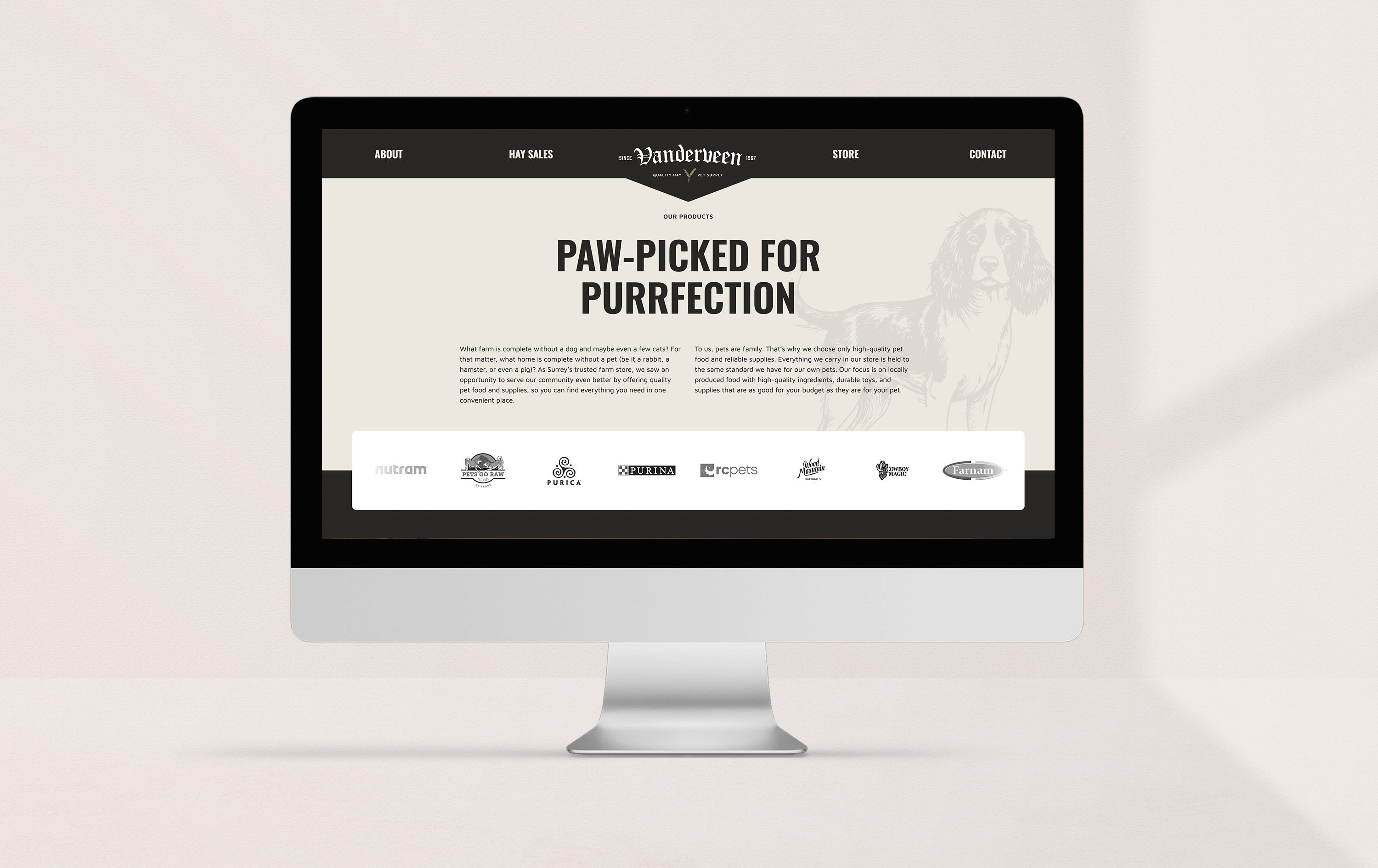
Studiothink started with strategy, identifying who Vanderveen needed to reach, where the perception gaps were, and what the business stood for beyond hay bales. The answer was clear: a multigenerational commitment to quality, integrity, and the kind of service that makes customers feel like neighbours. The move from Vanderveen Hay Sales to Vanderveen Hay & Feed was the first decision, a precise and deliberate one. It preserved the legacy and the equity while opening the brand to every product and customer segment the business had already earned the right to serve.
From there, everything was built from the ground up. The old logo had done its job for years, but it belonged to a different chapter. Studiothink designed a complete visual identity that honoured the heritage of the business while positioning it as a modern, credible retail brand. The new logo, colour palette, and brand voice were developed together as a unified system, one that could speak to a sixty-year-old hay customer and a thirty-five-year-old pet owner in the same breath without losing either one.
The website was built to match. Designed and developed to make Vanderveen discoverable in search, credible on arrival, and easy to navigate for every audience from long-time hay buyers to pet owners looking for premium feed across the Lower Mainland. Visibility and trust were the twin objectives, and every page decision was made with both in mind.
The result is a brand that carries the full weight of Vanderveen’s history and the reach to grow well beyond it.