
Studiothink Blog
Smart, bold, wine-fuelled articles on websites, marketing, and branding.
Why creativity is about to become the most valuable thing in business.
An email we got last week told us nothing about the project. But it told us everything about where business is heading.
Why do 97 out of 100 people leave your website without doing anything?
You spent real money on your website. So why are 97 out of 100 visitors walking away without doing anything?

What makes someone choose your business? The psychology of brand choice.
95% of purchasing decisions happen before rational thinking begins. So why are you still leading with features and price? Here’s the real psychology behind why people choose one company over another.

This is the worst time to have a forgettable brand. So why are so many companies making it worse?
In an uncertain economy, the instinct is to cut and protect. But the companies that survive what’s coming aren’t playing it safe. And in the age of AI search, that decision is more costly than it has ever been.

We use AI to write copy. Here’s where it fails, and how you can use our method to fix it.
We love writing too much to let a machine do it for us. But we had to get honest about where AI helps and where it fails. Here’s exactly how we use it.

Why AI can’t build a brand strategy for your B2B company. And what a real one actually looks like.
AI can write your brand strategy in four minutes. The question is whether you want a brand that sounds like everyone else, or one that actually wins business.

Bad website or bad brand? Why most companies fix the wrong problem.
Most companies blame the website. After almost three decades, we can tell you the website is rarely the problem. Here’s how to find out which one you actually have.

Why the AI age makes your brand more important than ever
Everyone is racing to win in AI search but what if we are focussed on the wrong problem. Your brand could be the key.

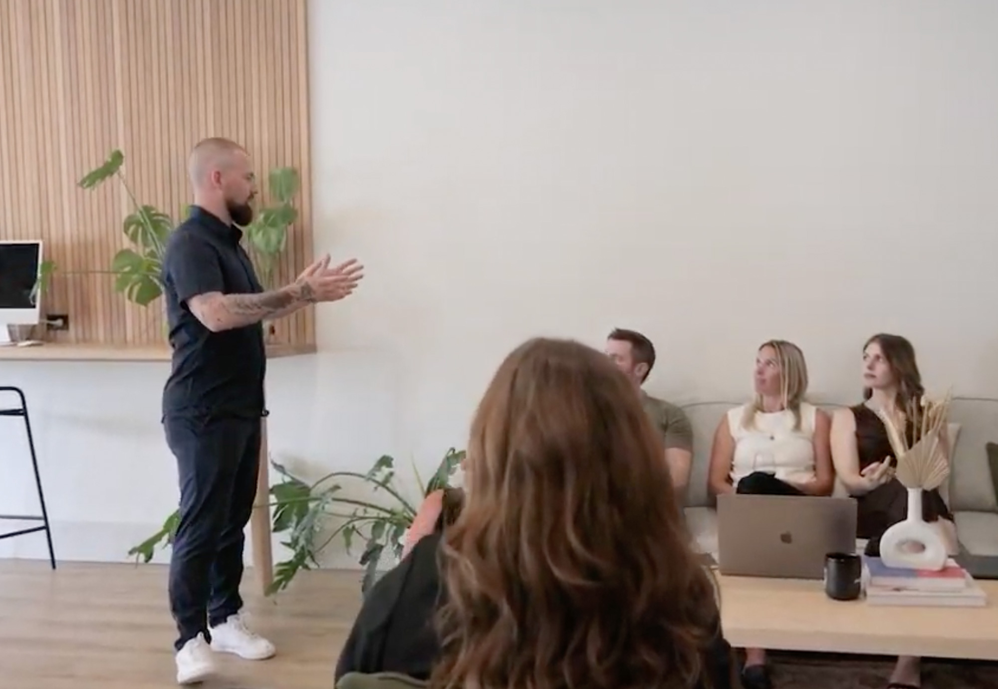
This is business, done differently. This is the next evolution of Studiothink.
Studiothink enters its next chapter by strengthening leadership from within. A clear decision rooted in intention, continuity, and building a Canadian agency designed to last.
What’s the price of authenticity?
As a leader, it’s our job is to challenge how much technology is allowed in our work, to show people that authenticity, creativity and experiences matter.

Is your company website costing you clients?
Is your business losing clients because of an outdated website? Learn key signs it’s time for a redesign and how to choose an agency in 2025.

The truth about AI that marketers aren’t talking about.
Your brand is now filtered through algorithms before it ever reaches a human. And if your website, messaging, and strategy aren’t built for that reality? You’re invisible.

What should I look for in a web design agency?
Here’s a crazy fact. 88% of website users won’t return to your site after a bad experience. Here’s how to make that experience amazing, the first time.

How much does a website cost? A complete guide.
This guide provides an in-depth breakdown of website pricing in 2025, covering different types of websites, their costs, pros and cons, and which one is the best investment for your business.

5 trends for 2025: CEO insights on strategy, storytelling and creative growth.
The companies that will thrive in 2025 are the ones that commit to showing up—boldly, creatively, and with a human touch. Here’s five ways to excel in 2025.

Leading with creativity. The secret behind thriving companies.
Creativity isn’t just a marketing tool—it’s a mindset, it’s the heartbeat of how you lead, manage, and grow a company.

Our road to becoming a remote company.
The roadblocks, questions, pros and cons we uncovered on our road to becoming a remote company, and how we are doing it differently. And yes, it still involves wine.

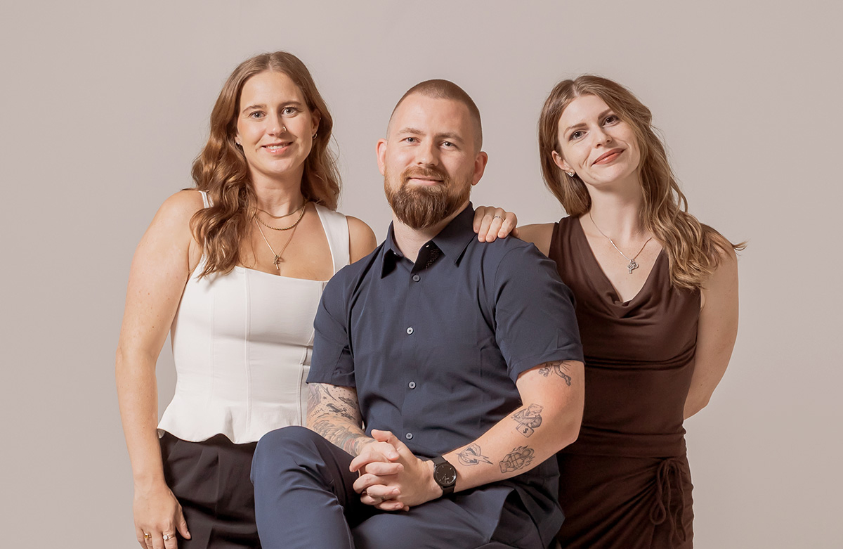
Studiothink announces leadership transition.
Sherry Jacobi, a veteran presence in Studiothink for over two decades, will be stepping into the role of sole owner and Chief Executive Officer.

What is a human experience company?
Being a human experience company means creating memorable, emotionally charged moments that stick with people and keep them coming back. Here’s how to do it.

Why telling a brand story propels business growth.
The ability to captivate an audience is the ultimate superpower. A brand story that is well written can be a persuasive method to reach audiences.

Why work with Studiothink?
When you work with Studiothink for branding and web development, you’re partnering with industry leaders who know how to turn your vision into reality.

What do you truly want?
Once you are truly honest with what you want, it becomes easier to know where you want to go, and it becomes so much easier to get there.

The pros and cons of a company rebrand.
If you are considering a rebrand for your company, consider all the pros and cons before you start.

Single-tasking. A simple strategy to being more productive.
What is single-tasking? It’s the practice of focusing solely on one task until completion, and it will make you a better marketer and entrepreneur.

How to stay human in an AI world.
Leveraging AI means leaving the important part of writing—the part that connects people with stories crafted from our experiences—to humans.

5 amazing things a website can do (that we bet you didn’t know).
Websites have powerful potential beyond just e-commerce and forms. We explore a few features that could really put your websites to work.

Master the art of creating positive momentum.
Leaders who support, nurture, teach and guide those around us can create a ripple effect. Here are five ideas to make your office a space for positive change.

The truth no one wants to hear about remote work.
Remote work might be enticing, but as leaders, it’s our job to get creative about how to design offices where people can connect and share ideas.

A purposeful life.
We live in a society that has healthcare, clean water, plenty of food, opportunity to do anything we choose. So what do the Maasai have that we don’t?

The importance of authenticity in business.
Authenticity needs to be the lifeblood of your business, every single corner of it. Being authentic gains customer trust, and that trust is very valuable.

Should I rebrand my business?
A rebrand is a lot more than your logo; it’s the image you present to the world in order to find and attract like-minded people. Are you ready to rebrand your business?

What is a Brand Rebel?
Brand rebels know that being like everyone else doesn’t change the world. They live outside of the comfort zones their industry has set, thriving on change, and struggling with set boundaries. Are you one?

5 things that brand can do for your company.
A brand is a living thing that communicates your story and acts as the ambassador of your business. But, what can it do for your company?

5 simple ways to be a great boss.
You might think the effort of improving your presence and skills as a boss isn’t worth the effort, but I’m here to tell you these five simple things absolutely are.

Sofa leaders. Can great leadership exist without being present?
Today’s leaders will have no choice but to adapt and learn new skills to lead this new generation of remote workers. But, can leadership exist without being present?

Leadership when it’s most difficult.
Leadership and the values that support it can’t come and go when it’s hard, they have to be a constant thing that you do, no matter what.

How to write a kickass brand story.
Telling a good brand story attracts people who have the same values as you, and draws in people who want to rally and champion for the same things as you.

The importance of being unplugged.
The pressure to be responsive and the constant barrage of notifications is doing us harm. Sometimes you just need to take action—and that means unplug.

How to stay positive when work goes sideways.
It may not always seem so easy to do, but here are some ways to stay positive when faced with adversity.

Building your brand using value-based relationships.
There’s a reason you might not be gaining as many customers as you could. The secret lies in finding out how to create value-based relationships.

Where do entrepreneurs find inspiration and motivation?
On those days (or weeks) when you feel your leadership mojo slipping away, there are plenty of things you can do to recharge. Here are some you can do right now.

Nine proven ways to attain and retain great employees.
As business owners, we often get wrapped up in the operations of our company. The outcome of those efforts will be based on the staff you have. Hiring and retaining the right people is crucial.

Branding vs. marketing. The importance of a brand first approach.
If you want to achieve sustained success, invest in brand first, marketing second. A well-communicated brand is a game-changer in attracting and retaining customers.

Why your company needs authentic core values.
Core values. Some call them bullshit. But around here we hire, fire, live and work by them. Here’s how to create your own company core values.

What is a branding agency? And, what does a branding agency do?
A branding agency creates more than just a pretty logo or website, and if you aren’t feeling passionate about your company, it’s time to read this explanation of what we do.

What is content marketing? Finally, a non-boring explanation.
Content marketing sounds like another tedious business activity, but wait until you hear what content marketing really is and what it can do for your business growth.

Building a tribe. How to get employees to buy in to your brand.
These guiding (and somewhat unconventional) principles will help you create a company brand that employees can feel connected to.

The power of purpose driven brands.
Today the conversation about brand needs to be about more than look; it needs to be about uncovering your purpose and putting it to work for you. Here’s how.

What is a brand analysis?
Business growth stalled out? It’s time to start putting your brand to work. The average company sees a 9% increase in revenue from a strategic rebranding.

Crowdculture—How to build brand traction.
To attract customers, today’s brands must deliver substance and authentic content. There is even have a fancy new buzzword for this authenticity—Crowdculture.